Dashboard Guide
This guide describes all dashboards in the NetFlow and SNMP Analytics App, organized by navigation section. Each entry opens with what the dashboard helps you do, followed by a screenshot and a panel-by-panel reference.
Many dashboards have been consolidated. See the Legacy Dashboard Mapping section below, or refer to the 2.12.0 documentation for the full previous dashboard reference.
Overview
Network Overview
Start here when something looks wrong and you need to know where. The default landing page gives you a device-centric health summary in one screen, so you can spot the misbehaving device, the unusual traffic mix, or the active threat before drilling in. This is the first stop in the triage workflow.
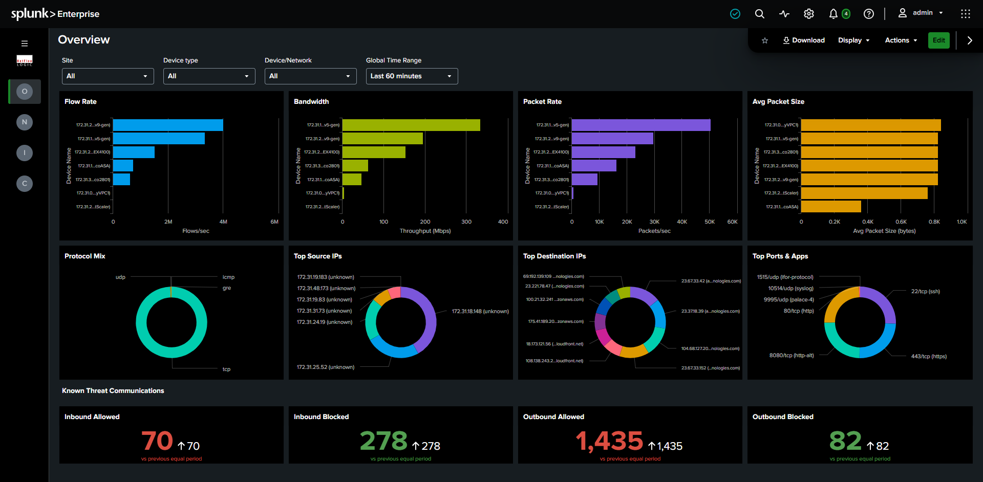
Required module: Module 10062 (Network Conversations). Falls back to Module 10067 (Top Traffic) when 10062 data is unavailable, see Top Traffic Fallback.
Filters: Site, Device Type, Device / Network, Time Range.
What it shows:
- Row 1, Device metrics: Four panels showing device performance: Top Devices by Flows/sec, Throughput (Mbps), Packets/sec, and Average Packet Size. When a specific device is selected, these switch to time-series charts for that device. Read the four together to fingerprint device behavior: high packets with low bytes signals a small-packet flood, and a low average packet size can indicate scanning or DDoS.
- Row 2, Traffic breakdown: Four donut charts showing Protocol mix, Top Source IPs, Top Destination IPs, and Top Destination Ports & Apps across the filtered scope. Use these to answer "what does normal look like here, and is this it?" at a glance.
- Row 3, Known Threat Communications: Four KPI panels showing flow counts for threat traffic only (
threat_list_nameis populated): Inbound Allowed, Inbound Blocked, Outbound Allowed, Outbound Blocked. Red panels require investigation, green panels confirm your controls are working. Clicking any panel jumps to the Security Events dashboard with the matching filters pre-set, so you go from "there's a problem" to "here's the detail" in one click.
Network Conversations
Network Conversations
Your primary tool for answering "who is talking to whom, and about what?" One flexible dashboard replaces five older ones (Network Conversations Bidirectional, Top Applications, Top Users, Applications & Users, and By Protocol & Port). Instead of switching dashboards to change your investigation angle, you change the Group By selector and every panel re-pivots at once.
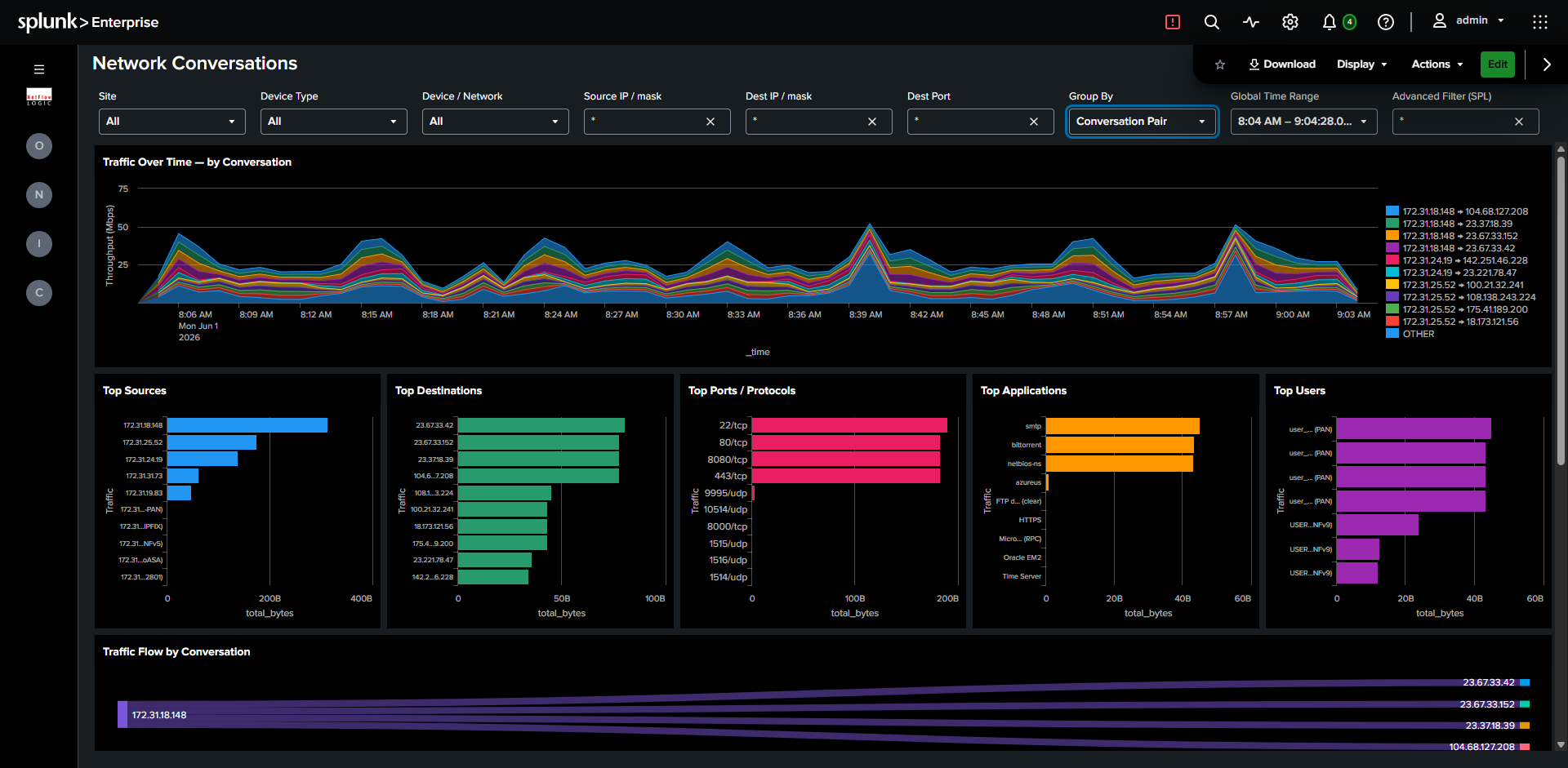
Required module: Module 10062.
Filters: Full filter chain, plus a Group By selector between Device/Network and Source IP.
Group By controls how traffic is analyzed across all panels simultaneously, so you can move from a host-pair view to an application or user view without leaving the page:
| Group By | Shows |
|---|---|
| Conversation Pair | Source and destination host pairs |
| Protocol & Port | Destination port and transport protocol |
| Application | Application name from DPI or NetFlow options |
| User | Username from identity enrichment |
What it shows:
- Row 1, Timechart: Traffic over time, stacked by the selected Group By dimension. Click and drag to time-brush, which filters the detail table to the selected window so you can zoom straight to the spike you care about.
- Row 2, Primary dimension + Top Destinations: Ranked bar chart of the selected Group By dimension alongside a fixed Top Destinations panel. Titles and colors update with the Group By selection.
- Row 3, Supporting dimensions: Two additional ranked bar charts showing the most useful context for the current investigation mode. For example, when investigating by Conversation Pair, Row 3 shows Top Applications and Top Ports.
- Row 4, Sankey: Full-width traffic flow diagram. Source and target dimensions respond to the Group By selection: two-node for Conversation Pair, three-node chain (Source, middle dimension, Destination) for Application, User, and Protocol & Port. This is the fastest way to see the shape of traffic rather than just its ranking.
- Row 5, Detail table: Fixed columns regardless of Group By: Device/Network, Flow Type, Session Origin, Source, Destination, Dest Port, App, Sent, Received, Rcvd/Sent %, Avg Duration, Flow Count, plus conditional User and Threat columns. Filtered by the time-brush selection. Clicking a row pre-fills the Source IP and Dest IP filters without leaving the dashboard, so you can narrow an investigation with a single click.
Security Events
Answer "are we under attack, and are our controls holding?" in one place. This dashboard consolidates threat detection and policy enforcement (replacing Cyber Threats, Top Violators, and Accepts & Rejects) so you can see malicious communications, the internal hosts involved, and what your firewalls actually blocked, side by side.
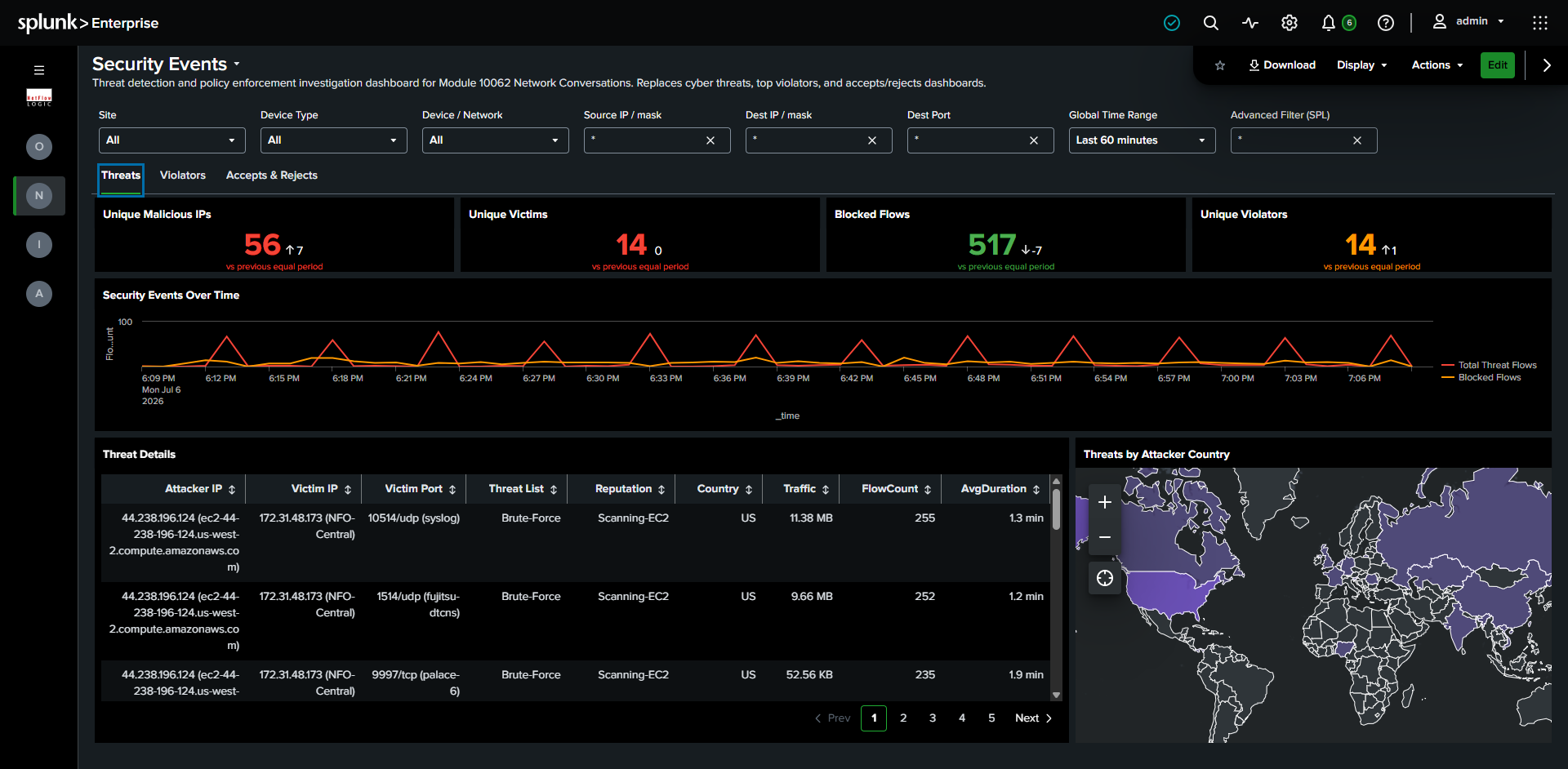
Required module: Module 10062 with Threat Intelligence configured in NFO.
Filters: Full filter chain.
What it shows:
- Row 1, KPIs: Four entity-count panels: Unique Malicious IPs, Unique Victims (internal hosts that communicated with malicious IPs), Blocked Flows, and Unique Violators (distinct internal sources being blocked). These count distinct entities rather than flows, which is a more operationally useful measure of scope than the flow-count KPIs on the Overview dashboard: one noisy host generating thousands of flows still counts as one victim.
- Row 2, Timechart: Threat events and Blocked flows on a shared time axis. Fixed, so it does not change when switching tabs. Time-brushing here filters all three tabs at once.
- Row 3, Tabs:
- Threats: Map of attacker countries with an enriched table including Threat List and Reputation columns, so you can prioritize by how dangerous the source is.
- Violators: Internal sources being blocked, with Application, Dest Port, and Action columns, useful for finding misconfigured hosts or policy gaps.
- Allows & Blocks: Four horizontal bar charts showing Allowed and Blocked traffic by conversation pair and by port, a quick way to confirm a policy is doing what you intended.
Geographic & ASN
See where your traffic actually goes in the world, and which networks it crosses. Useful for spotting traffic to countries you don't do business with, or unexpected transit through a particular autonomous system. Replaces two previous dashboards, By Country and By Autonomous System.
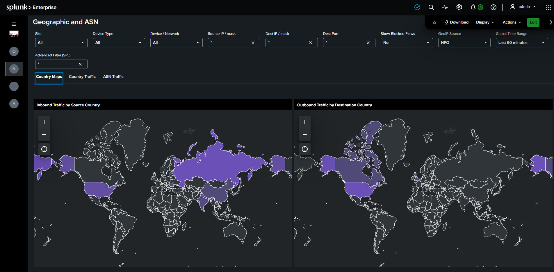
Required module: Module 10062.
Filters: Full filter chain, plus a Show Blocked Flows toggle and a GeoIP Source selector (NFO / Splunk).
What it shows:
- Country Maps: Two choropleth world maps side by side, Inbound Traffic by Source Country and Outbound Traffic by Destination Country, each country shaded by traffic volume so heavy talkers stand out immediately.
- Country Traffic: The same data as a ranked breakdown by country, when you need exact figures rather than a visual.
- ASN Traffic: Traffic ranked by autonomous system, identifying the networks your traffic is exchanged with, for example a cloud provider, a CDN, or an unexpected hosting network.
The GeoIP Source selector chooses how IPs are resolved: NFO uses NFO's real-time GeoIP enrichment, Splunk uses Splunk's built-in MaxMind iplocation lookup. Switch between them to compare, or fall back to Splunk if NFO GeoIP enrichment is not enabled on your flows. The Show Blocked Flows toggle excludes blocked and dropped flows when set to No.
Cloud Traffic
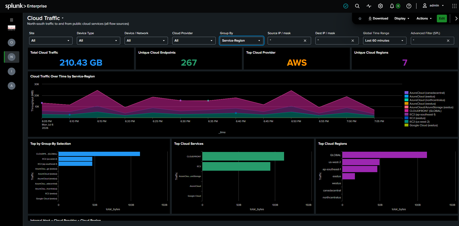
Understand what your network sends to the public cloud, and where. When you need to know which internal hosts are driving cloud spend or reaching services in unexpected regions, this dashboard surfaces cloud provider, service, and region context that raw flow data doesn't carry. NFO adds this context from the cloud IP ranges lookup (AWS, Azure, GCP, OCI).
Required module: Module 10062 with cloud enrichment configured in NFO.
Filters: Full filter chain, plus a Cloud Provider selector (All / AWS / Azure / GCP / OCI).
What it shows:
- Row 1, KPIs: Total Cloud Traffic, Unique Cloud Endpoints, Top Cloud Provider, and Unique Cloud Regions.
- Row 2, Top Cloud Services + Top Cloud Regions: Two horizontal bar charts showing which cloud services and regions receive the most traffic.
- Row 3, Sankey: Three-node chain, Internal Host to Cloud Provider to Cloud Region. This answers "which internal hosts are generating traffic to which cloud providers, and where in the world are they going?" in a single view.
- Row 4, Detail table: Standard columns plus Cloud Service and Cloud Region columns, always populated on this dashboard.
By VLAN
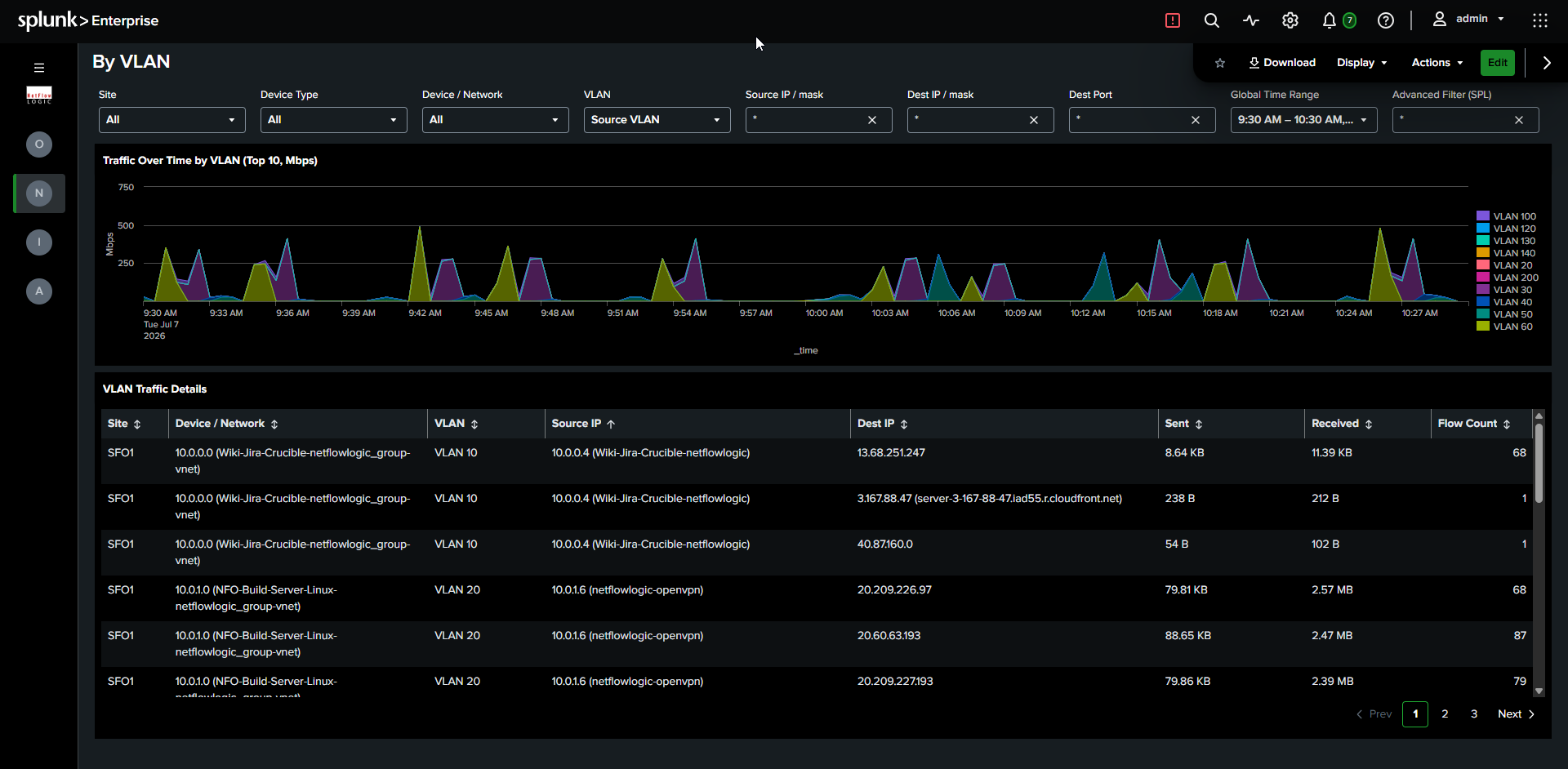
Confirm your segmentation is working, and catch traffic crossing VLANs it shouldn't. A quick way to verify that isolated segments stay isolated and to investigate unexpected VLAN-to-VLAN communication.
Required module: Module 10062.
Filters: Full filter chain.
What it shows: Traffic over time stacked by VLAN, with a detail table showing VLAN-to-VLAN communication pairs including source and destination IPs, bytes, and flow counts. Watch for pairs that shouldn't be talking, which is often the fastest signal of a segmentation gap.
Concurrent Connections
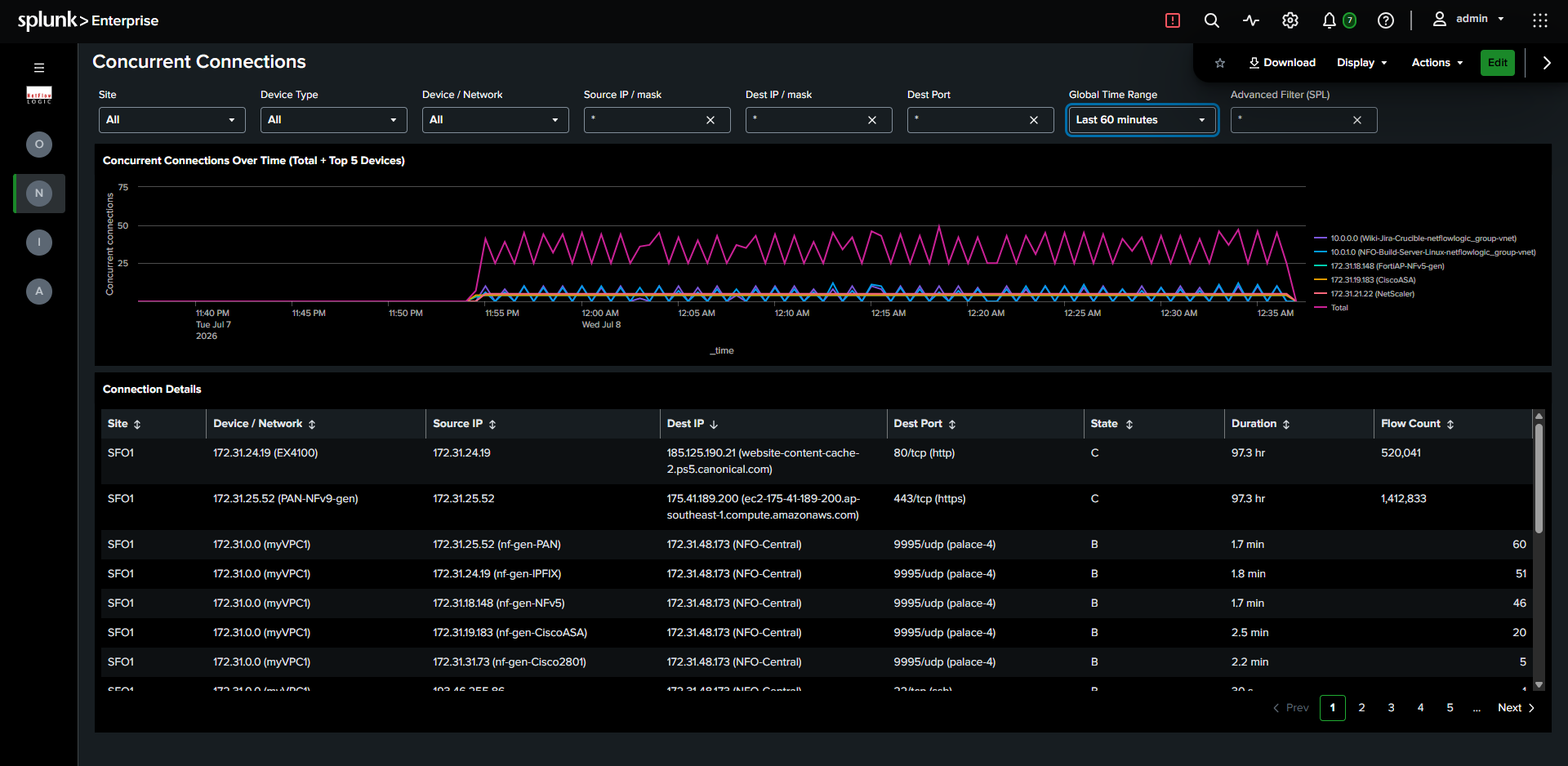
Catch connection floods and plan capacity from real connection counts. Sudden growth in concurrent connections is an early sign of a flood or a misbehaving application, and steady growth informs sizing decisions.
Required module: Module 10062.
Filters: Full filter chain.
What it shows: Line chart of concurrent connection count over time (total plus a breakdown by top 5 devices), with a detail table including connection state (Begin / Continuing / End) and duration. The per-device breakdown tells you not just that connections spiked, but where.
Infrastructure Health
Network Topology with Insights
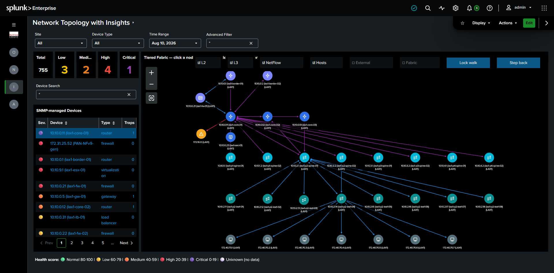
See your network the way it's actually built, then walk it device by device. This dashboard arranges discovered devices into infrastructure tiers (Edge, Core, Spine, Access, Endpoint) so the shape of your network is obvious at a glance, then lets you start from any device and expand outward through its neighbors. It's built for the question "what is this device connected to, and where does it sit in the hierarchy?"
Required modules: Module 10701 (Auto-discovery Reporter) for device inventory and Module 10062 for connection data. Topology is built from the device inventory (nfc_id=20701) and the connections between devices (nfc_id=20702).
Requires Dashboard Studio 10.4. This dashboard uses the splunk.networkGraph visualization with tier-based positioning, which is a 10.4 feature. Other dashboards in the app run on earlier Splunk versions, but this one specifically needs 10.4.
This dashboard reads node positions from the topology_tier_positions lookup, which a scheduled generator search keeps current with your live topology. The dashboard shows nothing until that lookup and its generator search are installed in the app. If the graph is empty, confirm with your Splunk administrator that the lookup definition exists, that the generator search is scheduled, and that it is returning data.
Filters: Site, Device Type, Time Range, Advanced Filter.
Layout: The left side has the filters, severity KPIs (Total, Low, Medium, High, Critical device counts), and a searchable list of SNMP-managed devices. The right side is the tiered topology graph. Overlaid across the top of the graph are three link-type checkboxes (L2, L3, NetFlow), three node-group toggles (Hosts, External, Fabric), and the two walk controls (Lock walk, Step back).
Reading the graph
Every device sits in a horizontal tier band according to its role in the network, with edge and core infrastructure at the top and endpoints at the bottom:
| Tier | Typical devices |
|---|---|
| Edge / WAN | Border and edge routers that peer with an external network |
| Core | Core routers, gateways, firewalls, and security appliances |
| Spine | Spine switches and L3 switches that carry no endpoint traffic |
| Access | Leaf switches, distribution and access switches, load balancers |
| Endpoint | Servers, storage, hypervisors, wireless APs, printers, UPS units, out-of-band management devices |
The five tiers describe the path traffic takes through the network. Firewalls and load balancers are not layers that traffic passes through on its way down the tree; they are services attached to a layer. Firewalls and security appliances therefore render in the Core band, where they route north-south traffic at the network boundary, and load balancers render in the Access band, alongside the leaf switches they attach to.
A device's vertical position (its tier) is stable: a spine always appears in the spine band no matter what you have walked to, because tiers are derived from the complete topology rather than from the devices currently on screen. Its horizontal position is not fixed. Visible devices are spread evenly across their band, so a device can shift left or right as you expand the walk, which keeps the layout compact.
A device is identified by its site together with its management IP, not by management IP alone. The same management IP used in two different sites therefore renders as two separate nodes rather than merging into one.
Each node carries a per-device-type icon (router, switch, firewall, load balancer, server, and so on) so you can read the role of a device at a glance without opening its tooltip. Node color shows the tier: indigo for Edge, blue for Core, cyan for Spine, teal for Access, and slate for Endpoint. Nodes that are not in your inventory carry their own colors: gray for an unmanaged peer, amber for an undiscovered device, and a muted blue-gray for a host (see Off-inventory nodes and hosts below). Link color shows the discovery protocol: Layer 2 links (LLDP, CDP, BRIDGE) in blue, Layer 3 links (OSPF, BGP, IP forwarding) in purple, and NEXT_HOP links in pink.
Node details on hover
Hovering any node shows the same fixed set of fields, in the same order, so you always know where to look:
- Name: the device's system name, or its IP when discovery never learned a name.
- IP: the management IP for a discovered device, or the far-end address for an off-inventory node.
- Device type: the discovered type (router, switch, and so on) for a managed device, or a category label (External peer, Undiscovered device, Unknown endpoint) for an off-inventory node.
- Tier: the band the node sits in.
- Discovered via: the discovery protocols that revealed the node, grouped by layer, for example
L2 (LLDP), L3 (IP_FORWARDING), NEXT_HOP. - Status:
In inventoryfor a device NFO polls, orNot in inventory (from connection data)for a node that exists only because a managed device reported a link to it.
Read the Status row first: it tells you whether the rest of the tooltip describes a device NFO actually manages or a node inferred from someone else's connection data. For an off-inventory node the values are necessarily thinner, because NFO never polled it.
Walking the topology
Rather than rendering every device at once (which no network graph handles well at scale), the dashboard shows a bounded set of devices around an anchor and lets you move through the network one hop at a time:
- Set an anchor by clicking a device in the left list. The graph expands to show that device and its neighbors, each in its own tier.
- Expand the walk by clicking any node in the graph, which brings that device's connections into view.
- Lock walk suspends node-click expansion so you can drag and inspect the graph without walking it; click it again to resume. The label reads "Lock walk" when active clicking is enabled and "Unlock walk" when locked.
- Step back removes the most recent hop. It grays out and reads "At start" when there is nothing left to undo. To return to the beginning, select a device again from the left list.
Keeping the visible set bounded to an anchor and its neighbors is what makes the graph render reliably. A full-site, all-devices view is not supported by the visualization, and the walk model is the intended way to explore a large topology.
Filtering the graph
A row of toggles overlaid on the graph controls what is drawn. Three are link-type filters, and three collapse crowded groups of nodes:
- L2, L3, NetFlow: link-type filters. L2 draws links discovered by LLDP, CDP, and BRIDGE; L3 draws links discovered by OSPF, BGP, and IP forwarding; NetFlow draws NEXT_HOP links learned from flow data. All three are ticked by default. Unticking one hides links discovered by that source; unticking all three clears the graph. Use them to see, for example, only the Layer 3 routed topology, or only the physical Layer 2 adjacencies.
- Hosts, External, Fabric: node-group toggles. Each collapses a crowded band into "+N more" bubbles to keep the canvas readable, or expands it into individual nodes. Hosts controls end stations learned from bridge tables, External controls unmanaged peers outside your estate, and Fabric controls the spine and leaf switches of a large fabric. See Off-inventory nodes and hosts below.
In Splunk's network graph, a node drag and a node click cannot be told apart, so dragging a node acts as a click and expands it. Use Lock walk when you want to drag and inspect without expanding. Because node positions come from your topology data, a dragged node returns to its tier position on the next render.
How tiers are determined
NFO discovery does not report a device "role," so each device's tier is derived from how it connects to the rest of the network, using the discovery source (con_source) of its connections across the complete topology:
- Edge: has a BGP session or a next-hop to an external (unmanaged) peer. An internal BGP session does not make a device an edge device, so devices in a BGP-based fabric (EVPN/CLOS) are classified by their position, not by the fact that they speak BGP.
- Core: routers and gateways. Firewalls and security appliances are placed here because they route north-south traffic at the core boundary.
- Spine: an infrastructure-only switch (no endpoint neighbors) with a Layer 3 uplink. Any of OSPF, IP forwarding, BGP, or next-hop counts as a Layer 3 signal, so BGP-only fabrics are recognized.
- Access: a switch with endpoint neighbors, or a pure Layer 2 switch connected to a spine, plus distribution and access switches. Load balancers are placed here because they attach to the leaf layer.
- Endpoint: servers, storage arrays, virtualization hosts, wireless APs, printers, power and management devices, and legacy hubs. A device whose type is not recognized also falls here.
The discovery sources used are LLDP, CDP, and BRIDGE at Layer 2, and IP_FORWARDING, BGP, and OSPF at Layer 3. NEXT_HOP is discovered from NetFlow.
Because tier is derived from connectivity, a device whose connections are only partially discovered can land in the wrong band. The generator search runs over the full topology to minimize this, and a device with sparse data falls back to the Endpoint band.
Off-inventory nodes and hosts
The far end of a link is often a device NFO does not manage. Rather than hide these, the topology draws them, classified by how they were discovered so their color and position stay honest. None of them can be walked to, because there is no inventory or connection data beyond them, and clicking one is a no-op.
- Unmanaged peers (gray, pinned above the Edge band) are external next hops and BGP peers outside your estate, such as an upstream ISP gateway. They mark the boundary of your managed network.
- Undiscovered devices (amber) speak LLDP, CDP, or OSPF but are missing from inventory, usually because they have no SNMP credentials or are out of discovery scope. They sit half a band below the managed neighbor that reported them. An amber node is a gap in discovery worth chasing, not a normal part of the topology.
- Hosts (muted blue-gray, Endpoint band) are end stations learned from switch bridge tables (BRIDGE), such as servers and workstations that run no discovery protocol of their own.
Because a single access switch can have hundreds of hosts, hosts collapse by default into one bubble per switch labeled with the count, for example "42 hosts @ lax1-leaf-03", to keep the graph readable. The Hosts toggle expands these into individual host nodes. Expansion is capped at 40 per switch; any beyond that collapse into a single "+N more @ switch" bubble so one busy switch cannot flood the canvas. The External and Fabric toggles work the same way for unmanaged peers and for large spine/leaf fabrics respectively, collapsing each crowded band into a "+N more" bubble or expanding it into individual nodes. Undiscovered devices always draw individually.
Links, direction, and discovery protocols
A link is drawn for every adjacency discovery has recorded.
One-way links are shown, not hidden. Most adjacencies are reported from both ends. Others are genuinely one-way: an external BGP peer or a next-hop gateway outside your managed estate will never report the adjacency back to you. A one-way link is normal and usually means the far end is outside the scope of discovery, not that data is missing. The far end of such a link is often an off-inventory node, described under Off-inventory nodes and hosts above.
Links discovered by several protocols are drawn once per protocol. The same physical link is often reported by more than one source, for example both LLDP and CDP, or both OSPF and IP forwarding. Splunk's network graph cannot separate two links between the same pair of nodes, so connectors that share a color sit on top of each other. Layer 2 and Layer 3 links use different colors and are both visible; two Layer 2 protocols on the same link (LLDP and CDP) will overlap. Because the overlap can hide this, a node's Discovered via tooltip field lists every protocol that discovered it, so you can still tell that both LLDP and CDP found a link even when they render as one line.
Network Device Health
Find your unhealthiest device fast, then see exactly why. One dashboard replaces three (Network Device Health, Interface Errors & Discards, and SNMP Devices CPU & Memory). It sorts devices worst-first and auto-selects the one most in trouble, so you land on the problem instead of hunting for it.
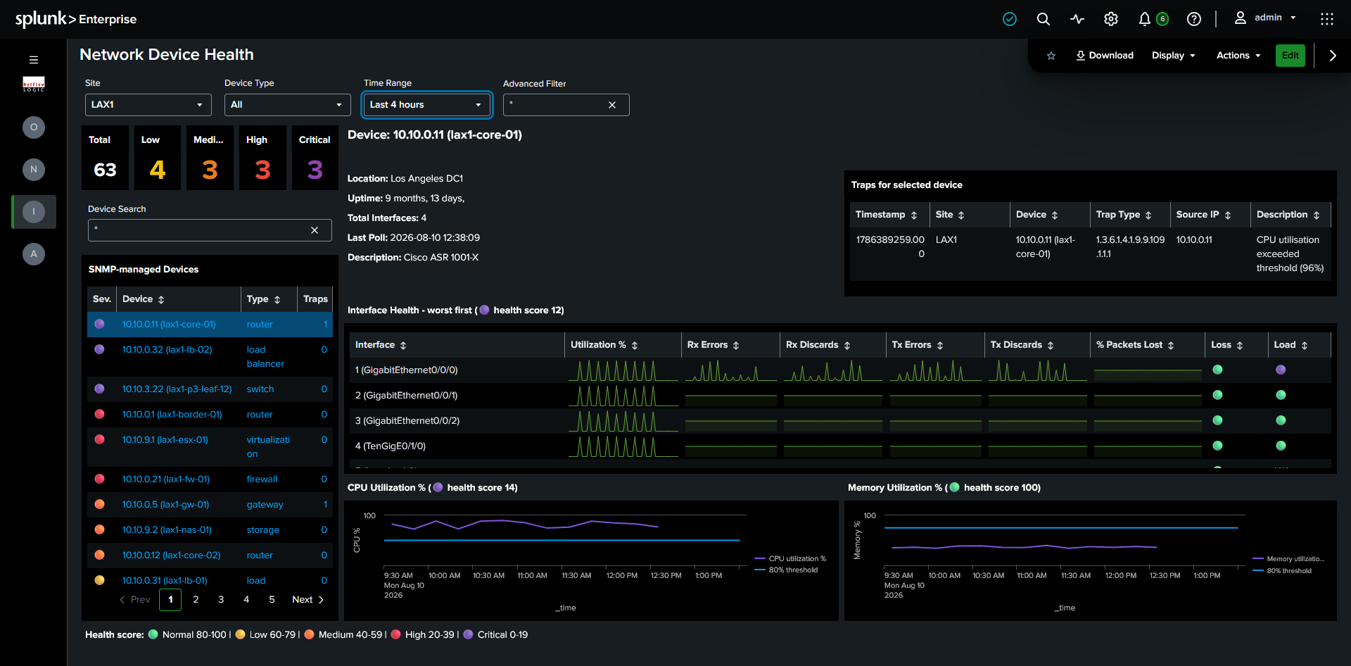
Required module: Module 10103 (SNMP Custom OID Sets Monitor). SNMP traps require NFO to be configured to receive and forward traps to Splunk, see SNMP Trap Inputs.
Filters: Site, Device Type, Time Range, Advanced Filter.
The left panel lists all SNMP-managed devices, sorted worst-health first, with a severity summary strip and a typeahead search box. The right panel shows full detail for the selected device. On load, and on any filter change, the worst-health device in scope is auto-selected, so the right panel is never empty and you never start from a blank screen.
Device Detail
Device Info is the identity card for the selected device, always showing the most recent poll values regardless of time range.
| Field | Source |
|---|---|
| Name | sysName |
| Description | sysDescr, OS version and hardware model |
| Location | sysLocation |
| Uptime | sysUpTimeInstance. Unexpectedly low uptime indicates an unplanned restart. |
| Total Interfaces | ifNumber |
| Last Poll | Timestamp of the most recent successful SNMP poll |
| Management IP | mgmt_ip |
Interfaces lists all interfaces for the device, sorted by health score, worst first (top 10 shown by default).
| Column | Description |
|---|---|
| Interface Name | ifName |
| Utilization % | Bandwidth utilization as a percentage of interface capacity |
| Rx Errors / Rx Discards | Receive error and discard counts |
| Tx Errors / Tx Discards | Transmit error and discard counts |
| % Packets Lost | Errors and discards as a percentage of total packets |
| Health Score | Per-interface score from 0 to 100, see Health Score |
CPU & Memory shows time-series charts of CPU and memory utilization over the selected time range, each with an 80% reference line. Titles show the device's CPU and memory health scores.
Traps shows SNMP traps from the selected device (or the 20 most recent across the site when no device is selected). Traps fire the moment an event occurs, so they catch problems that happen between polls.
| Column | Description |
|---|---|
| Timestamp | Most recent first |
| Device | Device name |
| Trap Type | SNMP trap OID |
| Source IP | IP address that sent the trap |
| Description | Human-readable trap description |
SNMP traps are ingested with nfc_id=20700.
Health Score
The health score exists so you can triage by a single number instead of reading raw counters on every interface. Each interface scores 0 to 100, the average of a Packet Loss Score (errors and discards as a percentage of total packets) and a Relative Load Score (utilization at or below 70% scores 100, dropping to 0 at 100%). If only one component is available, it's used alone.
The device severity score is the lowest of interface health, CPU, and memory, so a device with healthy interfaces but 92% CPU still shows Critical. This worst-of-three approach surfaces any device with a serious problem rather than averaging it away.
| Score | Severity | Color |
|---|---|---|
| 80 to 100 | Normal | 🟢 Green |
| 60 to 79 | Low | 🟡 Yellow |
| 40 to 59 | Medium | 🟠 Orange |
| 20 to 39 | High | 🔴 Red |
| 0 to 19 | Critical | 🟣 Purple |
TCP Health
Find the hosts that are aborting connections, not just generating traffic. A host resetting a large share of its own connections often points to a failing service, a misconfiguration, or scanning behavior that raw volume charts miss. This dashboard ranks hosts by TCP resets and, importantly, by the share of their own connections being reset, using the definitive exporter that sees the most resets for each host to keep counts accurate.
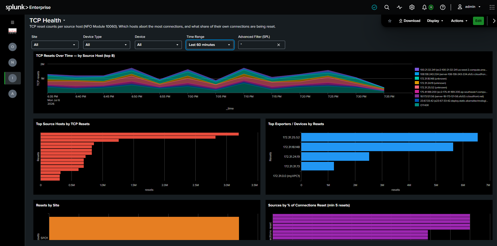
Required module: Module 10060.
Filters: Site, Device Type, Device, Time Range, Advanced Filter (SPL).
What it shows:
- TCP Resets Over Time by Source Host (top 8): Stacked area chart tracking reset volume for the eight highest hosts over the selected time range.
- Top Source Hosts by TCP Resets: Hosts ranked by total reset count.
- Top Exporters / Devices by Resets: The devices reporting the most resets, useful for locating where resets are observed.
- Resets by Site: Reset totals grouped by site.
- Sources by % of Connections Reset (min 5 resets): Hosts ranked by the share of their own connections that were reset (the
local_sharefield), filtered to hosts with at least 5 resets. A high percentage points to a host aborting most of its own connections rather than one simply generating high traffic, which is the signal that usually matters.
Administration
Setup & Configuration
The checklist that gets the app showing data. This built-in reference page walks through bringing the app online in three ordered steps, configure the NFO modules that produce the data, install and verify the TA-netflow add-on, and set up the app itself. Each step depends on the one before it, so work top to bottom.
The page includes a feature-to-module reference showing which NFO module powers each part of the app, handy when a dashboard is empty and you need to know which module to enable:
| Feature in this app | Required NFO module |
|---|---|
| Network Conversations (primary) | 10062 (Network Conversations Monitor) |
| Top Traffic (legacy fallback only) | 10067 (Top Traffic Monitor) |
| Network Topology | 10701 (Auto-discovery Reporter) |
| Device Health | 10003 / 10103 (SNMP Custom OID Sets / Polling) |
| TCP Health | 10060 (TCP Health Monitor) |
It also documents a sampling requirement: enable byte multiplication by sampling rate inside Module 10062 so bytes are pre-multiplied at collection time. The app uses byte values as-is and does not apply a query-time sampling lookup, so if 10062 is not pre-multiplying, your traffic volumes will read low.
Data Volume by Site
See what NFO data is costing you in Splunk ingest, and where it comes from. When you need to trim ingest or explain a spike, this dashboard breaks estimated volume down by site, device/network, and NFO module, dimensions the Splunk Monitoring Console cannot break out on its own.
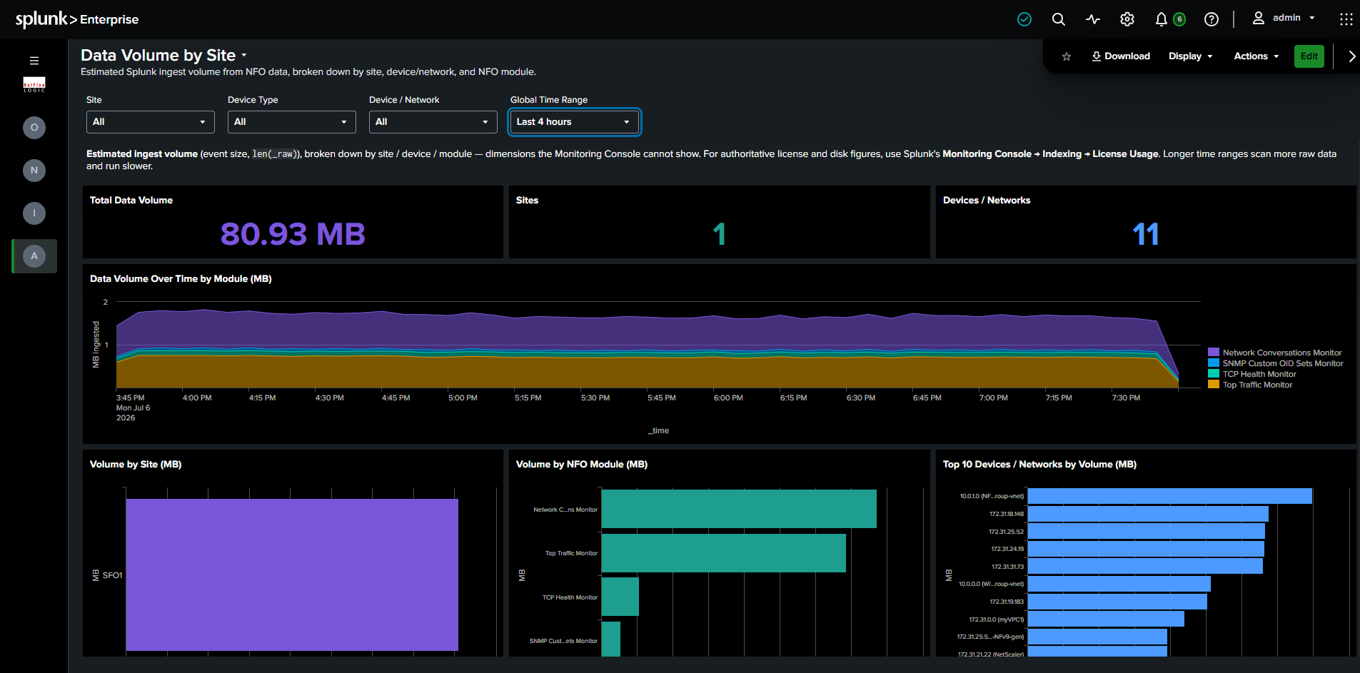
Required module: Any NFO module sending data to Splunk.
Filters: Full filter chain (Site, Device Type, Device / Network, Global Time Range).
What it shows:
- Row 1, KPIs: Total Data Volume, Sites, and Devices / Networks.
- Row 2, Data Volume Over Time by Module (MB): Stacked area chart of ingest volume over time, split by NFO module, so you can see which module drove a change and when.
- Row 3, Volume by Site, Volume by NFO Module, and Top 10 Devices / Networks by Volume: Three panels ranking ingest volume by each dimension, for finding the biggest contributors quickly.
Volume is estimated from event size (len(_raw)), not a metered byte count. For authoritative license and disk figures, use Splunk's Monitoring Console under Indexing, License Usage. Longer time ranges scan more raw data and run slower.
Top Traffic Fallback
When Module 10062 (Network Conversations) data is not available but Module 10067 (Top Traffic) data is present, the Network Conversations and Network Overview dashboards render in degraded mode:
- A persistent, non-dismissible banner indicates degraded mode is active and links to Module 10062 setup instructions.
- Group By options for Application and User are suppressed, since these fields are not available in Top Traffic data.
- Panels requiring 10062-only fields (Application, User, Session Origin, Duration) are replaced with an explanatory message.
- The detail table shows only 10067-compatible columns. The
percent_of_totalfield (native to 10067) replaces the Received and Rcvd/Sent % columns.
No dedicated Top Traffic dashboards exist in the navigation. All other flow dashboards (Security Events, Geographic & ASN, Cloud Traffic, By VLAN, Concurrent Connections, By Duration) require Module 10062 and show a "Module 10062 required" message if data is absent. They do not attempt a 10067 fallback.
Legacy Dashboard Mapping
| Previous Dashboard | Replaced By |
|---|---|
| Network Conversations Bidirectional | Network Conversations |
| Network Conversations Top Applications | Network Conversations (Group By: Application) |
| Network Conversations Top Users | Network Conversations (Group By: User) |
| Network Conversations Apps & Users | Network Conversations (Group By: Application or User) |
| Network Conversations By Protocol & Port | Network Conversations (Group By: Protocol & Port) |
| Network Conversations Cyber Threats | Security Events, Threats tab |
| Network Conversations Top Violators | Security Events, Violators tab |
| Network Conversations Accepts & Rejects | Security Events, Allows & Blocks tab |
| Network Conversations By Country | Geographic & ASN (View: Geographic) |
| Network Conversations By Autonomous System | Geographic & ASN (View: ASN) |
| Network Device Health | Network Device Health, Overview tab |
| Interface Errors & Discards | Network Device Health, Device Detail, Interface Health |
| SNMP Devices CPU & Memory | Network Device Health, Device Detail, CPU & Memory |
| All Hosts, Applications, Cloud, Firewalls dashboards | Network Conversations or Cloud Traffic |
All _ts, _metrics, _si variants | Retired, not replaced |
For documentation on dashboards not listed here, refer to the 2.12.0 documentation.